Robinson Estates
Creative Direction, Branding, Print Design, Web Design, UX/UI Design
Robinson’s initially approached us to develop a new website for them, but after an initial consultation the decision was made to give their brand an update too – their marketing hadn’t been updated for over 10 years so it was well in need of a refresh.
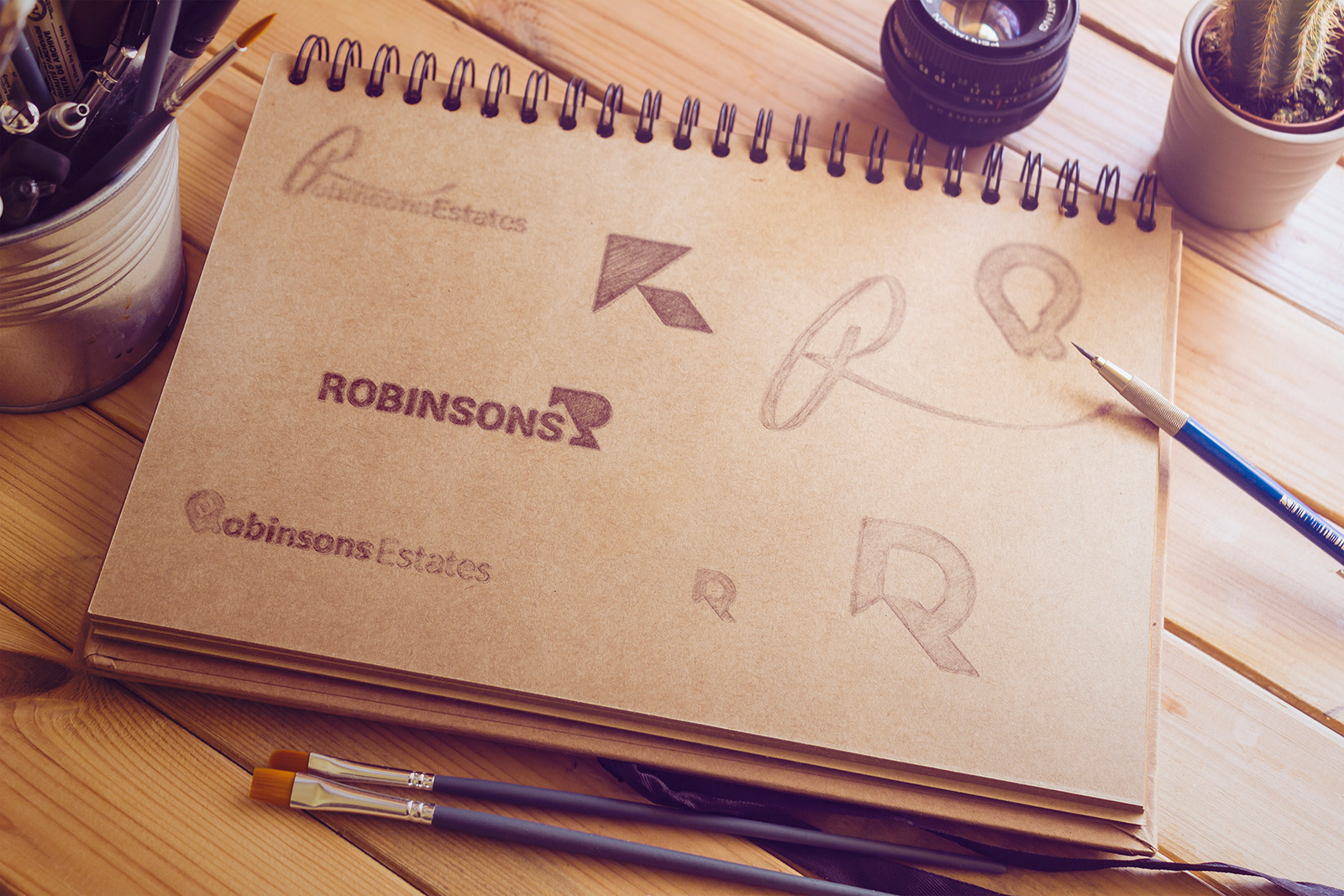
With so many clichéd property logos out in the wild, we wanted to focus more on the ‘R’ – and included a subtle reference to property within it. Robinson’s competitors typically had a very traditional feel, so we were keen to push for a slick, modern approach.


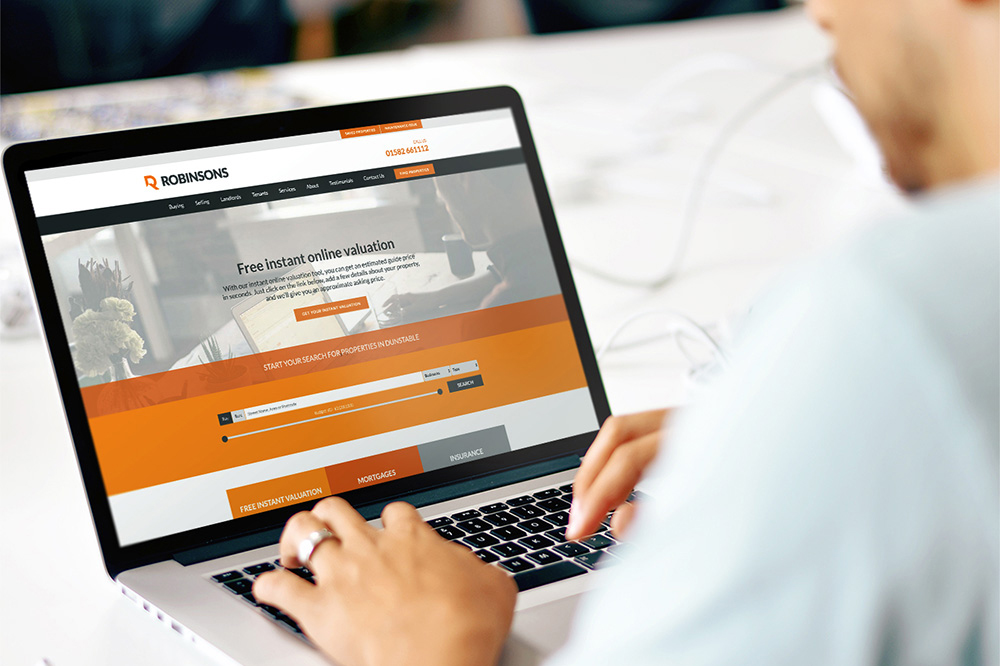
The website itself is driven by the spacious, modern branding, and we wrote the copy with a more informal tone – retaining the professional dialogue throughout.
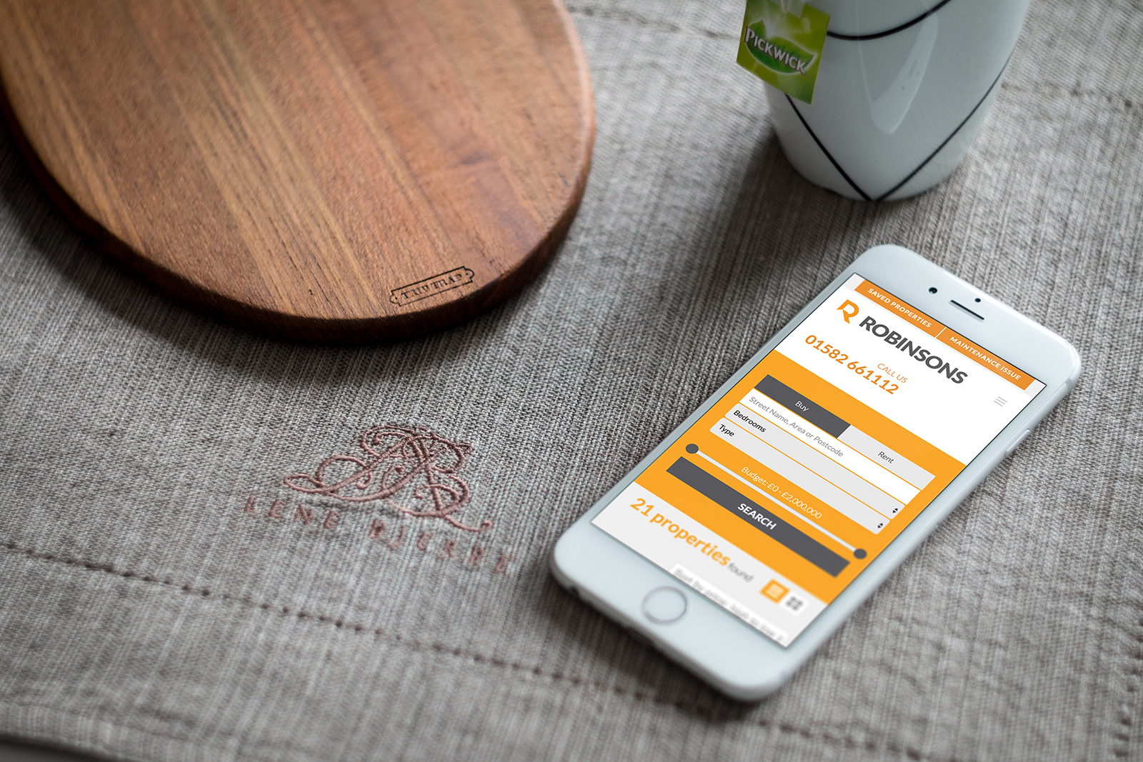
The property pages are written in a Single Page Application, delivering lighting fast results and a great user experience.


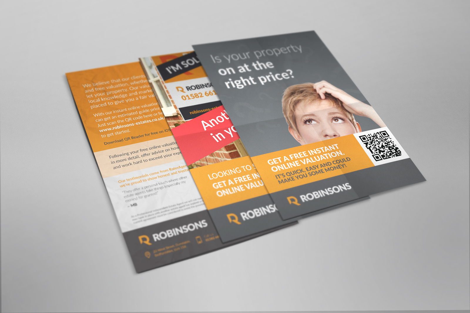
We gave all their current marketing collateral a revamp, also setting them up with MailChimp to deliver targeted email campaigns to their landlords, tenants and potential buyers. Using their database, they can track results and test to different users, sharpening the delivery each time.